On this page
A niche SaaS landing page should let a visitor establish three things before asking them to create an account: this is for a job I recognize, the product has a credible way to do that job, and I understand what taking the next step involves. A polished headline can introduce the promise. The rest of the page has to make it inspectable.
For an operator launching a service from finished software, that means choosing evidence from the product you actually have. A broad feature inventory is useful during evaluation, but it is not automatically the best introduction to one specific customer's problem. Select a small workflow, show the relevant screen and explain the boundary of the offer.
This article uses Formlet as the underlying product reference and develops a proposed landing page for a fictional website-maintenance intake service. SaaSCode offers Formlet. The niche positioning, copy and annotated page below are editorial proposals, not a shipped Formlet page, a customer case or a conversion experiment.
Start with the moment the buyer recognizes
Imagine a small agency that maintains client websites. Requests arrive as scattered messages: change this paragraph, replace that image, add a new page. The agency needs enough context to review each request before agreeing to do it.
A page opening with “The all-in-one platform for modern teams” gives that agency little to inspect. It does not identify the work, the person doing it or the result they should expect. A more useful proposed opening is:
Collect website-change requests in one place. Give clients a form for the page, requested change and context. Review their answers before agreeing on scope or a delivery date.
The narrower wording also limits the promise. It does not say that requests automatically become assigned tasks, that every submission is complete, or that the software decides whether the agency should accept the work. Those would require additional evidence and possibly additional product behavior.
Start with the buyer's language, then check whether it accurately describes the software. If the market or recurring job is still uncertain, the guide to finding the first paying customers for a niche SaaS addresses that earlier decision. A clear page helps communicate a relevant offer; it cannot establish demand by itself.
Connect each promise to something a visitor can inspect
Formlet's public product page describes building and publishing forms, sharing them, and reviewing responses. Those are relevant building blocks for an intake service. They do not establish the entire proposed agency workflow or prove that a particular configuration has been delivered.
Use the actual product to decide what the page can show. For this proposal, the most useful evidence would be a sample request form and the corresponding answer in the owner's response view. The first shows what the client is asked; the second shows what the agency receives. A feature icon labeled “Automation” would not answer either question.
Different evidence supports different claims:
| Proposed page claim | Evidence that would support it | What that evidence would still not establish |
|---|---|---|
| “Ask clients for the details needed to review a change” | A configured sample form with the relevant questions | That every client supplies sufficient or accurate information |
| “Review submitted answers in a response view” | A real response screen and, for a delivery claim, a matching submission observed through the intended flow | That a person has accepted, scheduled or completed the work |
| “Send accepted requests into your task tool” | A tested handoff to the named destination, with its limits disclosed | That every project-management system is supported |
| “Reduce the time spent clarifying requests” | A defined observation involving actual use, with context and measurement | A universal time saving for every agency |
The table is a proposed evidence standard, not a record of tests performed for this article. It helps an operator avoid sliding from a visible screen to a much larger business claim.
Use a real screen without making it prove too much
Here is the Responses image currently published in Formlet's catalog gallery. It shows the product's response-review surface, including filters, response entries and an export control. It is a useful reference for the kind of destination an intake page can explain.
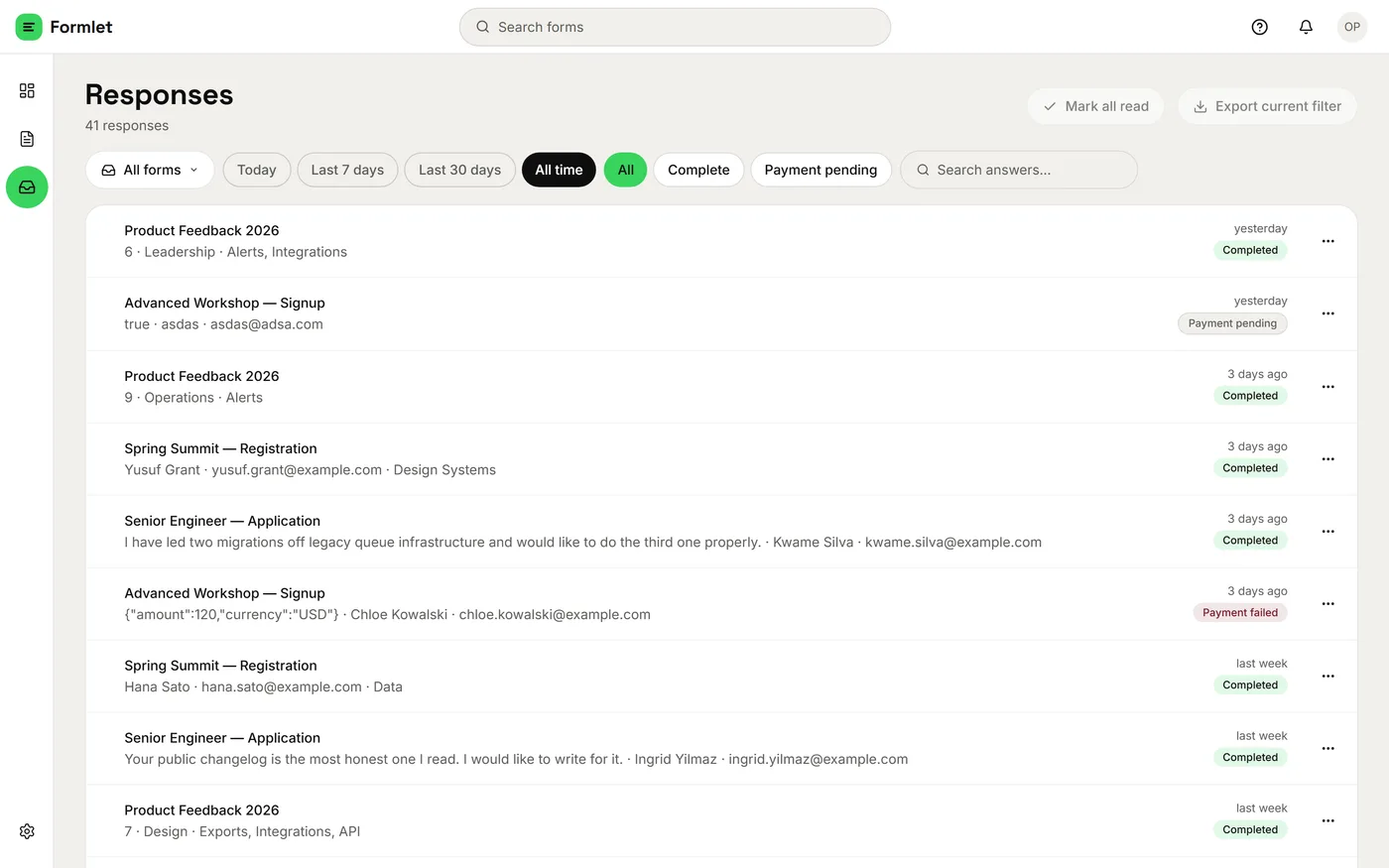
Source: Formlet's public catalog gallery, retrieved October 19, 2026. Original published product screenshot, resized for this article; its original capture date is not supplied. The displayed entries and counts are not evidence of customer adoption. This is not the proposed website-maintenance configuration, and we did not execute a submission or export to produce this image.
That qualification matters. A screenshot can show the visible organization of a response list. It cannot prove that a new request travels reliably from a particular form into that list, that an export contains every expected field, or that an integration assigns a task. A visible control is evidence that the interface contains the control, not proof that its operation has been tested.
For the fictional agency service, the next proof asset to create would be a clearly marked example containing a page URL, a requested change and supporting context. In an authorized test environment, follow that same example from submission to review. Then show the relevant portions together and label the data as an example. Do not replace the current screenshot's rows and present the edited result as a captured product state.
Keep real customer information out of public proof unless its use is authorized. An invented example can explain a workflow honestly when it is labeled. An invented testimonial or customer logo implies an endorsement that did not happen.
A proposed page with a reason for every section
For this intake service, a compact page could follow the visitor's questions in this order:
First, identify the job. The opening names website-change requests and the agency reviewing them. The supporting line explains what the client supplies and what the agency does next. It avoids promising automatic fulfillment.
Then show both sides of the exchange. Present a sample form beside the corresponding response, once that flow has been verified. Use captions to identify which screen belongs to the client and which belongs to the agency. Until the configured example exists, keep it labeled as a proposal rather than displaying a mockup as product evidence.
Explain what remains a human decision. The agency reviews scope and timing. If the service does not create tasks or send acceptance messages automatically, say so next to the workflow. A short boundary can be more useful than another row of features.
Make the offer understandable. Before asking someone to start, explain the actual plan, relevant limits, what setup is required and whether help is included. The operator must supply these facts for their service; Formlet's source-code purchase price is not the subscription price of the business they might operate.
Give one primary next action that answers the remaining uncertainty. In this proposal, “See a sample request” is a sensible first action because the visitor still needs to understand the exchange. The sample should lead to the promised example, with a clear route to start using the service afterward. It should not unexpectedly open a sales calendar or demand an email address just to reveal a static screenshot.
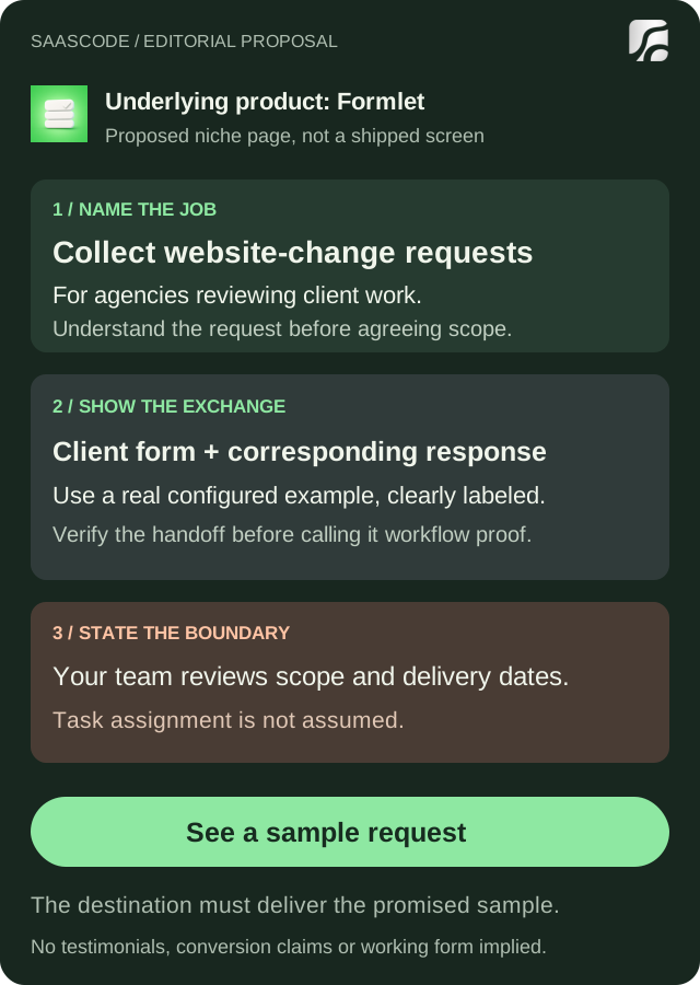
Original editorial proposal using the real Formlet and SaaSCode icons. This is a schematic of a possible page, not a working landing page or a shipped product screen. A real configured form-to-response example is still needed before using that section as workflow proof.
One primary action does not mean removing navigation, pricing or help. It means making the page's main invitation understandable. A visitor who already knows the product may want to start immediately; another may need a sample. The page can support both without giving every link the same visual weight.
Ask for an email when its purpose is clear
Account creation is appropriate when the next step needs a workspace that belongs to the visitor. A contact email is appropriate when they are requesting a response. Neither purpose should be hidden behind an ambiguous “Get started.”
Describe what happens after the action: create a workspace, open a sample, request onboarding help or begin a stated trial. If a payment method is required, disclose that before the person reaches the form. If the offer needs a conversation before setup, say what the conversation will resolve.
For the proposed intake service, a public sample can answer “Is this how my clients would send a request?” Account creation then answers a different need: “I want a form and response workspace for my agency.” That is a coherent progression, not evidence that a public sample will outperform a signup-first page.
Avoid asking for details that have no role in the promised next step. A person viewing an example should not have to invent a company size or project budget to proceed. When additional information is genuinely necessary, explain why it helps deliver the service.
The first session after signup must also match the page. If the landing promises a usable intake path but the account opens into an unexplained empty dashboard, the promise has only moved the confusion. Our guide to helping a SaaS customer reach a first useful result develops that next stage separately.
Let the search result and the page describe the same offer
A niche page needs a clear topic, but repeating a keyword does not make the promise more credible. A possible search phrase for this fictional offer is “website change request form for agencies.” That is a hypothesis about intent, not measured demand. It describes a different visitor from someone searching for source code to operate a form platform.
Google's SEO Starter Guide recommends clear, concise titles that accurately describe a page. It explains that search snippets can come from page content and sometimes the meta description, and advises placing clear images near relevant text with descriptive alt text. Apply those basics to the actual offer rather than expecting metadata to compensate for an unclear page.
For this proposal, the title, opening and sample should all concern collecting website-change requests. A title promising an “AI project manager” would attract a different expectation. A meta description promising automatic assignment would be misleading if the page only demonstrates form collection and manual review.
Keep the important explanation as page text, not only inside a hero image. Describe what the screenshot shows and what the visitor should notice. A decorative illustration can introduce the theme; it should not replace the product evidence.
Do not create many near-identical industry pages by changing only the profession in the headline. A distinct page needs a distinct job, example or offer that the product supports. If serving a new niche requires a different workflow, resolve the adaptation to that niche before advertising it as available.
Review understanding before celebrating a click
Before launch, ask someone who resembles the intended buyer to look at the page and explain what they think it does. Listen for the job, the expected result, the main limitation and what they believe will happen after clicking. Their interpretation may reveal a promise you did not intend to make.
For the agency example, “My clients send requests and we review the answers” matches the proposed scope. “It schedules our developers automatically” reveals a mismatch. Rewrite the promise or provide the missing behavior; a higher button-click count would not resolve that misunderstanding.
After launch, observe the whole journey available to you: people reaching the page, opening the sample, creating a workspace and completing the intended first task. Keep traffic sources and the observation period clear. A click is an action, not a customer outcome; a small early sample is not a reliable conversion benchmark. This article reports no such measurements.
The practical starting point is one page with a promise you can support, a real product reference, visible boundaries and a next action that does what it says. Finished software gives the operator something concrete to demonstrate. The landing page's job is to make that evidence useful to the right buyer.
Editorial collaborations
Something useful to add?
Bring a documented case, an expert perspective or a better source to the SaaSCode blog.
Editorial collaborations